Demographics
Population Projections: The World’s 6 Largest Countries in 2075
![]() See this visualization first on the Voronoi app.
See this visualization first on the Voronoi app.
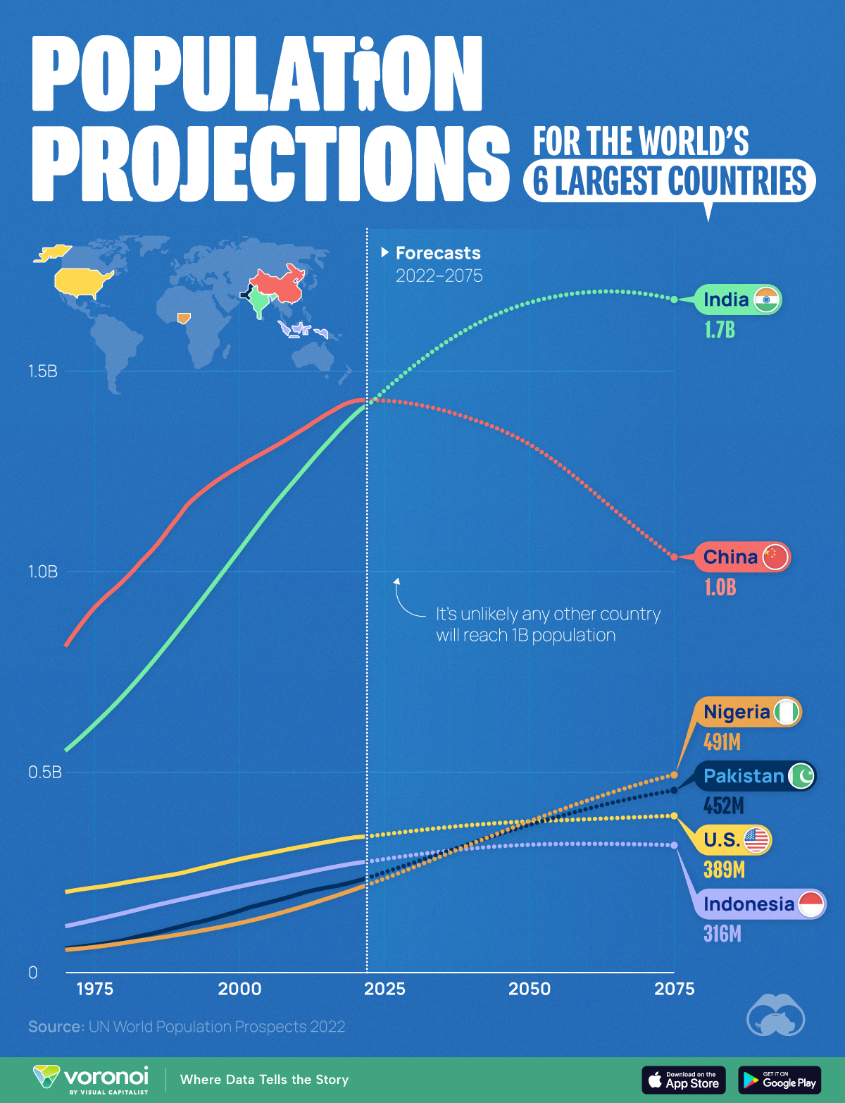
Population Projections for the World’s 6 Largest Countries
This was originally posted on our Voronoi app. Download the app for free on Apple or Android and discover incredible data-driven charts from a variety of trusted sources.
The end of the 21st century will see the first plateauing (and eventually shrinking) of world population since the Industrial Revolution. As birth rates fall across the globe, what does this mean for the world’s most populous countries?
To find out, we visualized forecasts for the world’s six largest countries using data from the latest revised version of the UN World Population Prospects 2022.
Projections are based on a “medium fertility scenario”, which assumes countries will converge at a birth rate of 1.85 children per woman, by 2045-2050.
China’s Projected Population Decline
China’s population boom has officially come to an end, with the country reporting two consecutive years of decreases (down 850,000 in 2022, and 2.1 million in 2023).
| Year | 🇨🇳 China | 🇺🇸 U.S. | 🇮🇩 Indonesia |
|---|---|---|---|
| 1970 | 812M | 199M | 114M |
| 1980 | 975M | 222M | 146M |
| 1990 | 1,144M | 246M | 181M |
| 2000 | 1,260M | 281M | 213M |
| 2010 | 1,344M | 310M | 242M |
| 2020 | 1,424M | 335M | 271M |
| 2030E | 1,417M | 351M | 291M |
| 2040E | 1,380M | 366M | 308M |
| 2050E | 1,317M | 375M | 317M |
| 2060E | 1,211M | 381M | 319M |
| 2070E | 1,091M | 387M | 318M |
| 2075E | 1,035M | 389M | 316M |
Note: Figures are rounded.
The country’s population in 2050 is forecasted to be 1.32 billion, which is roughly the same as it was in 2007. The UN believes this demographic downtrend will accelerate as we enter the second half of the century.
What does this mean for the Chinese economy? Many worry that a smaller workforce, coupled with an aging population, will increase healthcare expenditures and hamper economic growth.
India’s Population Boom Continues
Meanwhile, the UN believes that India’s population will peak somewhere in the mid 2060s, just shy of the 1.7 billion mark.
India’s population will not age as quickly as its neighbor. Those over the age of 65 will represent less than one-fifth of the population until 2060, and their share of India’s total number of people and will not approach 30% until 2100.
| Year | 🇮🇳 India | 🇵🇰 Pakistan | 🇳🇬 Nigeria |
|---|---|---|---|
| 1970 | 551M | 58M | 55M |
| 1980 | 689M | 79M | 72M |
| 1990 | 861M | 114M | 94M |
| 2000 | 1,050M | 152M | 121M |
| 2010 | 1,232M | 192M | 159M |
| 2020 | 1,390M | 225M | 206M |
| 2030E | 1,509M | 272M | 260M |
| 2040E | 1,608M | 320M | 318M |
| 2050E | 1,668M | 366M | 375M |
| 2060E | 1,695M | 406M | 427M |
| 2070E | 1,691M | 439M | 472M |
| 2075E | 1,678M | 452M | 491M |
Note: Figures are rounded.
Finally, whether these predictions come true or not will depend on how quickly birth rates fall as the country develops. For example, India’s fertility rate fell from 6.2 in 1950, to 2.0 in 2021 (births per woman).


Demographics
Ranked: Countries Where Youth are the Most Unhappy, Relative to Older Generations
Conventional wisdom says that young adults (those below 30) tend to be the happiest demographic—but this is not true for these countries.
Countries with the Biggest Happiness Gaps Between Generations
This was originally posted on our Voronoi app. Download the app for free on iOS or Android and discover incredible data-driven charts from a variety of trusted sources.
“They say a person needs just three things to be truly happy in this world: someone to love, something to do, and something to hope for.” — Tom Bodett
Measuring happiness is tricky business, more so when taking into account how different regions, cultures, and faiths define it. Nevertheless, the World Happiness Report attempts to distill being happy into a single score out of 10, and then ranks countries by their average score.
We’ve visualized the high-level findings from the latest happiness report in this series of maps. However, the report also dives deeper into other significant trends in the data, such as a growing disparity in happiness between age groups within countries themselves.
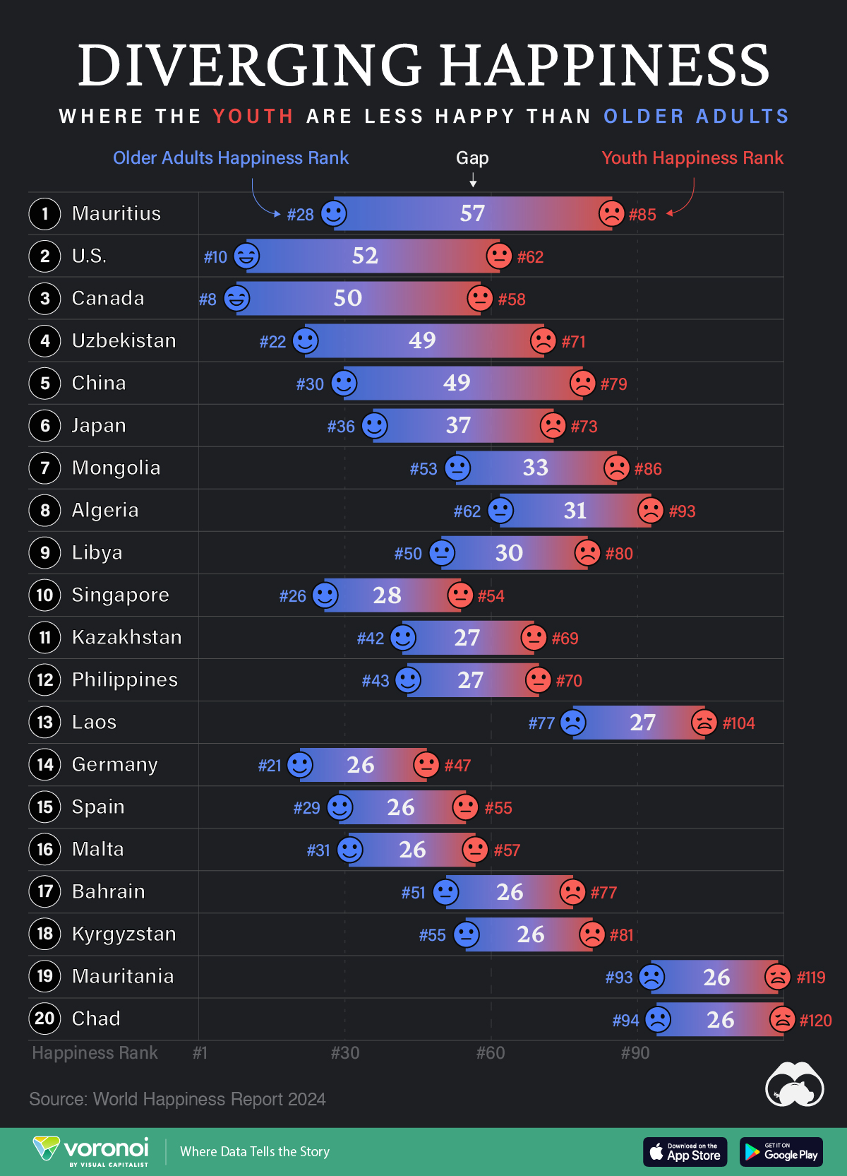
In the chart above, we list countries by the biggest gaps in happiness ranks between young adults (<30) and older adults (60+). A higher number indicates a larger gap, and that the youth are far unhappier than their older counterparts.
Where are Youth Unhappier than Older Adults?
Mauritius ranks first on this list, with a massive 57 place gap between older adult and youth happiness. The 1.26 million-inhabited island nation briefly reached high income status in 2020, but the pandemic hit hard, hurting its key tourism sector, and affecting jobs.
The country’s youth unemployment rate spiked to close to 25% that year, but has since been on the decline. Like residents on many similarly-populated islands, the younger demographic often moves abroad in search of more opportunities.
| Rank | Country | Youth Happiness Rank | Older Adult Happiness Rank | Happiness Gap |
|---|---|---|---|---|
| 1 | 🇲🇺 Mauritius | 85 | 28 | 57 |
| 2 | 🇺🇸 U.S. | 62 | 10 | 52 |
| 3 | 🇨🇦 Canada | 58 | 8 | 50 |
| 4 | 🇺🇿 Uzbekistan | 71 | 22 | 49 |
| 5 | 🇨🇳 China | 79 | 30 | 49 |
| 6 | 🇯🇵 Japan | 73 | 36 | 37 |
| 7 | 🇲🇳 Mongolia | 86 | 53 | 33 |
| 8 | 🇩🇿 Algeria | 93 | 62 | 31 |
| 9 | 🇱🇾 Libya | 80 | 50 | 30 |
| 10 | 🇸🇬 Singapore | 54 | 26 | 28 |
| 11 | 🇰🇿 Kazakhstan | 69 | 42 | 27 |
| 12 | 🇵🇭 Philippines | 70 | 43 | 27 |
| 13 | 🇱🇦 Laos | 104 | 77 | 27 |
| 14 | 🇩🇪 Germany | 47 | 21 | 26 |
| 15 | 🇪🇸 Spain | 55 | 29 | 26 |
| 16 | 🇲🇹 Malta | 57 | 31 | 26 |
| 17 | 🇧🇭 Bahrain | 77 | 51 | 26 |
| 18 | 🇰🇬 Kyrgyzstan | 81 | 55 | 26 |
| 19 | 🇲🇷 Mauritania | 119 | 93 | 26 |
| 20 | 🇹🇩 Chad | 120 | 94 | 26 |
Conventional wisdom says, and data somewhat correlates, that young adults (those below 30) tend to be the happiest demographic. Happiness then decreases through middle age and starts increasing around 60. However, the above countries are digressing from the pattern, with older generations being much happier than young adults.
That older generations are happier, by itself, is not a bad thing. However, that younger adults are so much unhappier in the same country can point to several unique stresses that those aged below 30 are facing.
For example, in the U.S. and Canada—both near the top of this list—many young adults feel like they have been priced out of owning a home: a once key metric of success.
Climate anxieties are also high, with worries about the future of the world they’ll inhabit. Finally, persistent economic inequities are also weighing on the younger generation, with many in that cohort feeling like they will never be able to afford to retire.
All of this comes alongside a rising loneliness epidemic, where those aged 18–25 report much higher rates of loneliness than the general population.
Source: The World Happiness Report which leverages data from the Gallup World Poll.
Methodology: A nationally representative group of approximately 1,000 people per country are asked to evaluate their life on a scale of 0–10. Scores are averaged across generations per country over three years. Countries are ranked by their scores out of 10.

-

 Personal Finance1 week ago
Visualizing the Tax Burden of Every U.S. State
-

 Misc6 days ago
Visualized: Aircraft Carriers by Country
-

 Culture6 days ago
How Popular Snack Brand Logos Have Changed
-
 Mining1 week ago
Visualizing Copper Production by Country in 2023
-

 Misc1 week ago
Charted: How Americans Feel About Federal Government Agencies
-
 Healthcare1 week ago
Which Countries Have the Highest Infant Mortality Rates?
-
 Demographics1 week ago
Mapped: U.S. Immigrants by Region
-
 Maps1 week ago
Mapped: Southeast Asia’s GDP Per Capita, by Country